Background
The process of outfitting a home is not simple. Online furniture purchasing may be a solution to your never-ending shopping visits. However, there are some legitimate concerns about this recently discovered furniture purchasing alternative.
I attempted to address these concerns by providing a comprehensive buying experience for furniture.
ROLE: UX Consultant
TIMELINE: 3 Weeks
SECTOR: Retail
TOOLS: Adobe XD

Problems
A furniture e-commerce site may provide customers with the ease of purchasing at their leisure. However, some concerns stops people from shopping furniture online:
not able to see or touch the product ahead of time.
Returning a product is a hassle.
Shipping and returns are both costly
Not having knowledge about interior design.
Experience is not the same as strolling through a showroom.
Design Process

Competitor Research
I conducted domain research across some of the most popular existing furniture e-commerce sites to understand industry standards and key features.

Direct
-
IKEA
-
Urban Ladder
-
Pepperfry
Indirect
-
Amazon
-
eBay
-
Shein
Strengths
-
OTP login via mobile number
-
Safe delivery options
-
Consultations are available
-
Wide range of products available in multiple categories
-
Pest control option is also provided
Opportunities
-
Usability can be improved by adding key features on the homepage that can help users to navigate through the app with ease.
-
Add review to build trust among users
-
Add a section where users can ask frequent questions
-
Add a rating system that can help build trust and products can also be sorted based on it
Weaknesses
-
Negligible use of white space
-
Usability can be improved by providing only necessary details on homepage
-
Lacking product reviews
-
Help/ FAQ's is not present
-
AR mode often causes lagging issues
Threats
-
Saturated market with growing competition that may result in creation of similar apps.
-
Have to provide better payment options that the competitors to secure the customer base.
-
Have to fasten the speed of delivery to stop existing customers from exploring other apps with better delivery methods.
-
Lower the ads on the app to avoid annoying users

Key Insights
-
Too many advertisements irritate users.
-
Users utilize the search tool to identify the product they require and then use sorting/filtering to narrow down the product list.
-
Users prefer reviews and seller Q & A to determine whether the goods and seller are authentic and worth purchasing.
-
Users prefer a one-on-one deal or a substantial discount. They tend to avoid things that do not have discounts.
-
Users like a quick checkout experience with a few steps.
-
Users would want a solid refund policy as well as free shipping.
User Persona


Information Architecture

Wireframing
After studying the insights gathered from UX evaluation and competitor analysis, I went on to design the basic structure for the website.

Mid-fidelity Wireframes


Color Palette
The color Palette used throughout the app is in reference with the ‘Maynooth’ logo.
Primary 1
#FFB723
Primary 2
#132557
Accent Color
#19468A
Text
#444444
Background
#F8F8F8
Typography
The idea of this typeface is to be geometric, elegant, with a vintage feeling, for use at larger sizes. It is inspired by geometric sans serif designs from the 1920s. The x-height is half way from baseline to cap height, an unusual proportion


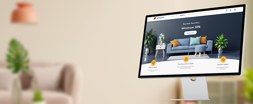
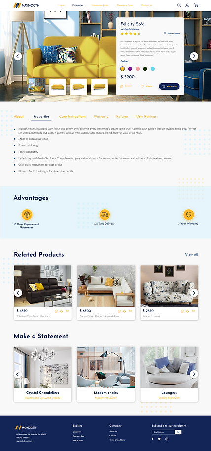
High Fidelity Visual Design


MORE PERSONAL PROJECTS


