

About ITR
This is the official portal of Income Tax Department, Ministry of Finance, Government of India. The portal has been developed as a Mission Mode Project under the National E-Governance Plan. The objective of this portal is to provide a single window access to the income tax related services for taxpayers and other stakeholders.
ROLE: UX Consultant
TIMELINE: 2 Days
SECTOR: Government
TOOLS: Figma
Evaluation
Wireframing
Research
Visual Design
Creative Process
This is the official portal of Income Tax Department, Ministry of Finance, Government of India. The portal has been developed as a Mission Mode Project under the National E-Governance Plan. The objective of this portal is to provide a single window access to the income tax related services for taxpayers and other stakeholders.
UX Evaluation
This analysis considers design best practices, usability compliance, functionality, information architecture, and pattern use. All of the issues with the existing site were identified and recorded. I was eventually able to work around them in the final design.

Too many options visible upfront
The webpage seems cluttered
Too many exit
points
No clear
navigation
Irrelevant and redundant information
Reduced
Readability
Too many categories being shown
No clear Call to action buttons
Outdated
Design

Goals
After understanding the problem statements, the main goals of the website redesign were established.
Declutter the landing Page
Reduce number of exit points
Improve aesthetic appeal, look and feel
Improve display of information and layout
Improve site
navigation
Remove Redundant
data
Improve site
analytics
Improve overall structure and interaction
Add simple subscription model
Competitor Analysis
Competitive analysis helps us learn about the ins and outs of how our competition works.
However, for this redesign job, I looked at similar websites and studied their strengths and weaknesses, as well as the type of design they used. This aided me in making informed design judgments.

California DMV

U.S. Department of States


Key Takeaways
-
Site navigation is very clear and robust
-
Big and bold Typography is used to gather user's attention
-
Content is crisp and concise
-
Excellent use of breathing space or whitespace
-
Subscription to website is presented bolding on the homepage
Wireframing
After studying the insights gathered from UX evaluation and competitor analysis, I went on to design the basic structure for the website.

Mid-fidelity Wireframes


Color Palette
There are five colors in the "Income Tax Department" logo. I used a color scheme that included a dominant, an accent, and a primary color. Overuse of colors is not recommended by UX principles since it may not be contrasted enough on mobile devices, bright colors might induce headaches, etc.
Linear Gradient
#05335F- #004A8F
Shade 1
#05335F
Shade 2
#004A8F
Text Color
#777777
Caption
#999999
Background
#FFFFFF
Typography
Geometric sans serif typefaces have been a popular design tool ever since these actors took to the world’s stage. Poppins is one of the new comers to this long tradition. Each letterform is nearly monolinear, with optical corrections applied to stroke joints where necessary to maintain an even typographic color.

.png)
Redesigned Landing Page


Old Design - Landing Page
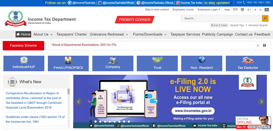
-
Echoing Hick’s Law, K.I.S.S. ("Keep It Short and Simple") states that simplicity is the key for a system to work in the best way. On this website, there are too many options given upfront, which makes it difficult for the users to make a choice.
In this case, it is necessary to categorize choice and obscure complexity. -
Interfaces should not contain information that is irrelevant or rarely needed. "Social media" links appear more than once on the homepage. This repetition does not aid in the user’s task completion or education.
-
The whitespace and content density are unbalanced. This balance should be maintained in order to attract people to explore the site further.
-
The navigation and information architecture are ineffective and inefficient.
-
The user should be able to tell where to focus their attention and what is most relevant on the site. This is challenging for the user due to the overall structure.
-
There is no clear "call to action" button.
-
The type of icons used is not consistent throughout the app.
-
The spacing used between the cards is inconsistent, and the use of whitespace is negligible, which decreases the site's readability.
-
The human psyche is heavily influenced by color. On the site, many colors are employed, including red, which is connected with warning, danger, or error scenarios. The color red is used to convey both information as well as tags like “new”.
New Design - Landing Page & beyond the fold content
.jpg)
First Fold
-
In this redesign, I attempted to include all of the key options up front.
-
To comply with Hick's law, content hierarchy is employed to limit the number of options available at any given moment.
-
Social media links are also displayed twice on the site, but in the appropriate places: in the first fold and then in the footer.
-
There is a floating feedback and assistance bar that may be dragged to different places on the page based on usage.
-
The icons are appropriate for the content, and their type, i.e., filled or solid, is constant across the page.
-
A distinct "call to action button" has been included in the carousel together with the required information for enhanced identification.
.jpg)
What's New Section
This portion of the current home page was simply represented by providing links up front. I've inserted images to make it more engaging and interactive. This section has been integrated with "Important Links" since the data in both parts overlaps. To access the specifics of any of the tabs, the user may click on them.
Frequently Asked Questions
This part is likewise reflected on the current Homepage by providing links up front. I've included the disclaimer information along with a link to read more. This section has been enhanced with images to make it more aesthetically appealing along with the options.
.jpg)
.jpg)
Testimonials and Achievements
I have given the testimonials and achievement in a carousel with clear indications whether the content is an appreciation or a testimonial.
Footer
All the important links are given in the footer along with the existing images and social media links.
.jpg)
MORE PERSONAL PROJECTS


